
PVS003 Physical Testing
Tag4u: [fjaa145800] < [fjaa185457] < [fjaareport] < [fjaawip]


Summary
This post presents numerous test results from a variety of systems. As of 250502 it is very much a work in progress. Even in this early state, it is still quite clear that the correlation between the anccelerometer and the dynamometer based error is not particularly good. There seem to be numerous mechanisms going on with each signal. Much more must be done to understand what’s happening.
One interesting question that this material raises is whether or not the dynamometer is the best measure of dynamic force accuracy. Since there are deviations in that signal, that we cannot explain with our current theory it really looks like things happen with the dynamometer that we don’t currently understand.
I am actually beginning to wonder if the accelerometer turns out to be our best tool for checking for likely dynamic force measurement errors. Much more study is needed!
Along with this study it now seems that learning how to check signal conditioning dynamic response by breaking piano wire is called for.
Plot Set A
Plot Area Details
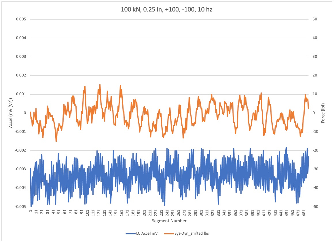
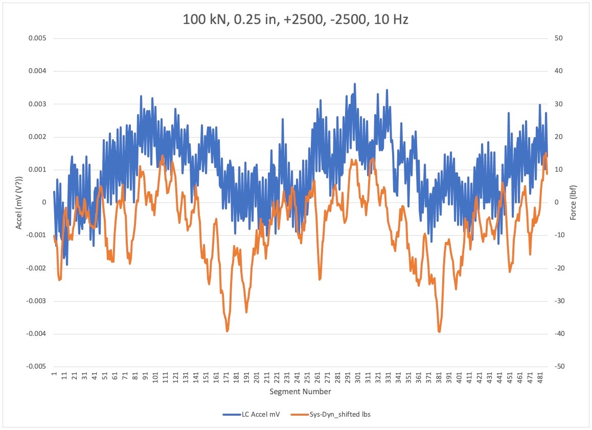
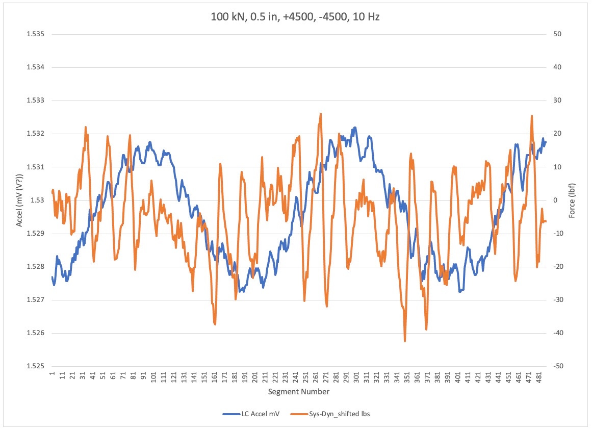
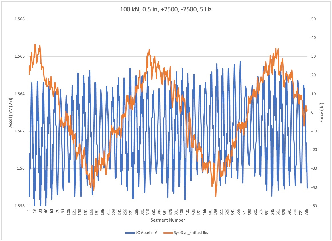
In the following plots, the left-hand axis is Force for the main load plot traces. The right hand access is loaded for the free load cell signal. The horizontal axis is the segment number for the points in the plots.
For the title of the plot, look at the highlighted tab below the plot.
Plot Discussion
This plot shows the difference between two tests. The left hand plot shows the free loadout. The right hand plot shows the acceleration for the accelerator on the low cell side of the grip. Below waveforms shown are misleading in these plots because when the free load cell signal was acquired, there was no specimen in the load frame. He actuator simply cycled the same distance as when the old cell had a specimen in it.
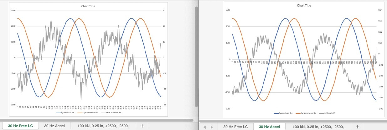
The plot below shows for Tess. Hear the spasm was the same throughout; the dynamometer. What changed was the test frequency. Unfortunately, for this set of plots I included the free load cell signal. What would’ve been better was to instead plot accelerometer. I hope to do that in the future.
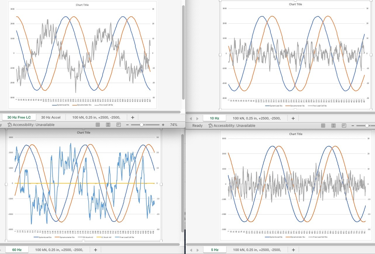
Plot Set B
Here are some different plots that illustrate a variety of effects that can be observed with an actual test machine.
Overview
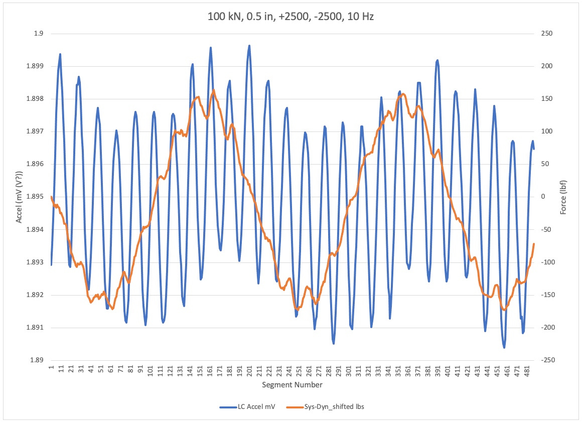
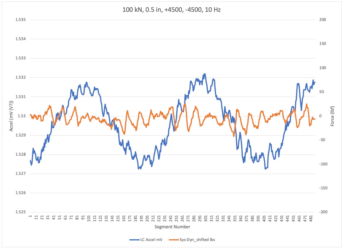
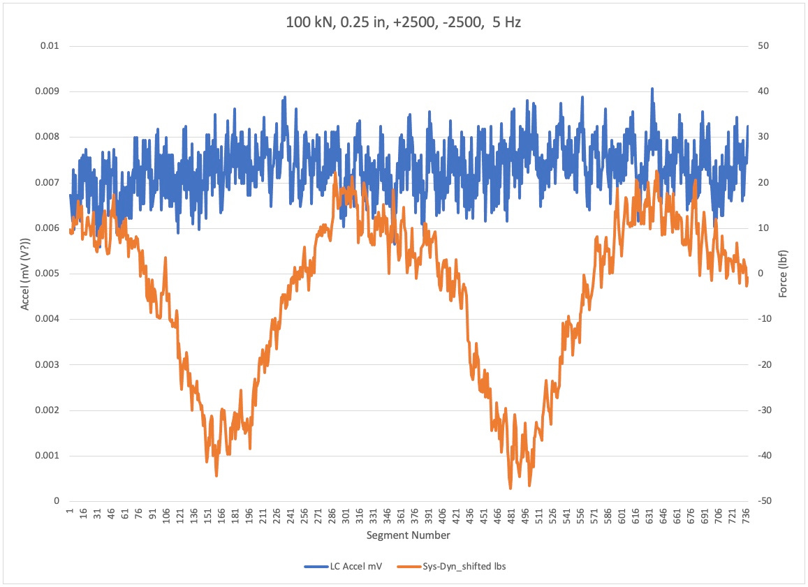
This part of four shows the dynamometer to load cell error in orange and the accelerometer on the low cell side of the grip in blue. The four plots are for the same loading condition, but different test frequencies.
Note the generally poor correlation between the dynamometer based error signal and the accelerometer. It is not clear in this plot, which is the more accurate indication of errors. Particular concern is the large variation in the orange signal for the 5 Hz test. That being the lowest frequency in theory, it should have the lowest acceleration. So why such large and a symmetrical dynamometer error??
Quantization
Note the shape of the orange line. That is the difference between the system cell and the dynamometer reading.
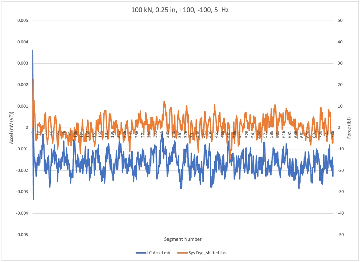
Noise Floor
This is a low frequency, low amplitude test. In theory the noise we see should only be from internal behaviors of the system. The frequency, in theory, is too low to generate any significant test frequency specific errors.
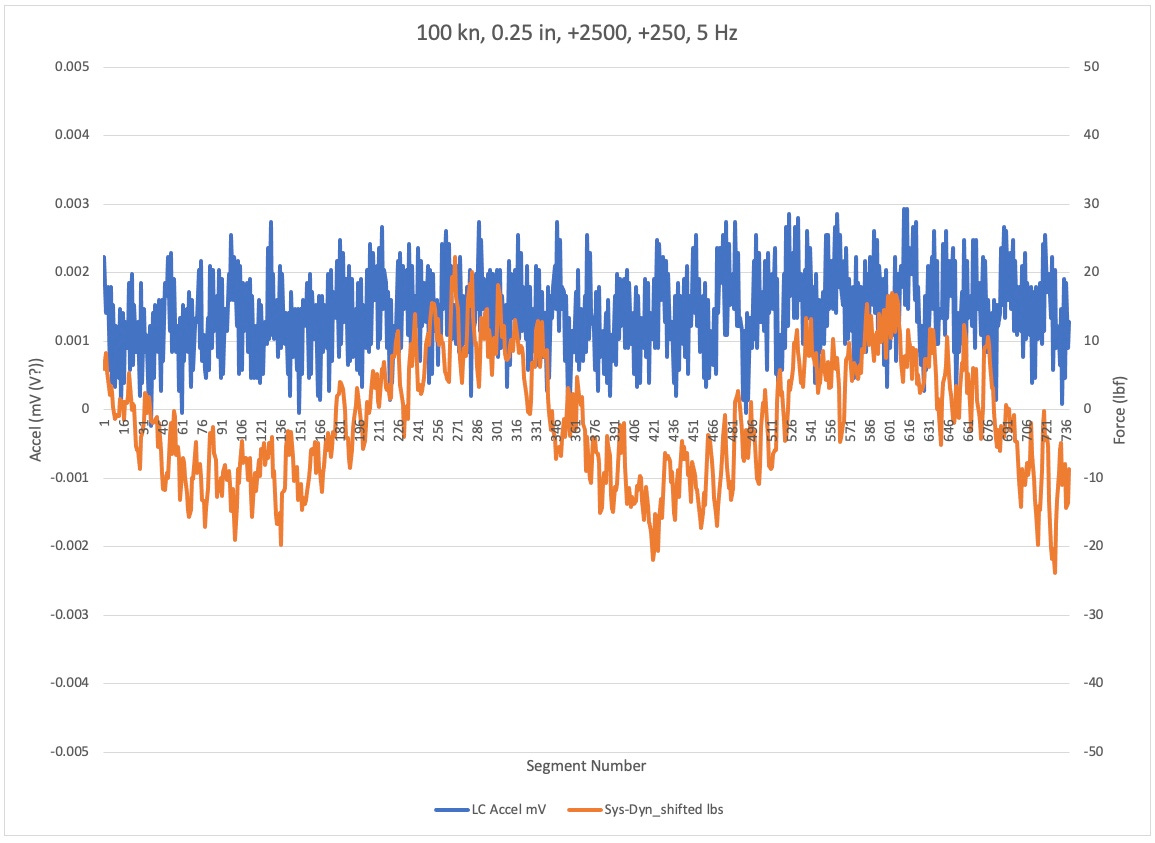
Increased Load Amplitude
The only difference between this plot and the previous plot is the increased load amplitude. Note how both signals have gotten larger and amplitude.
Increased Load And Stiffness
For this test the dynamometer was changed in its diameter to be twice the size of the other tests. I don’t know how the length changed but potentially this dynamometer is four times as stiff as the previous one. Additionally, this test goes to almost double the amplitude as the previous one. Note the acceleration signal is significantly less distorted Yet error between dynamometer and test system load cell is very similar to the previous plot.
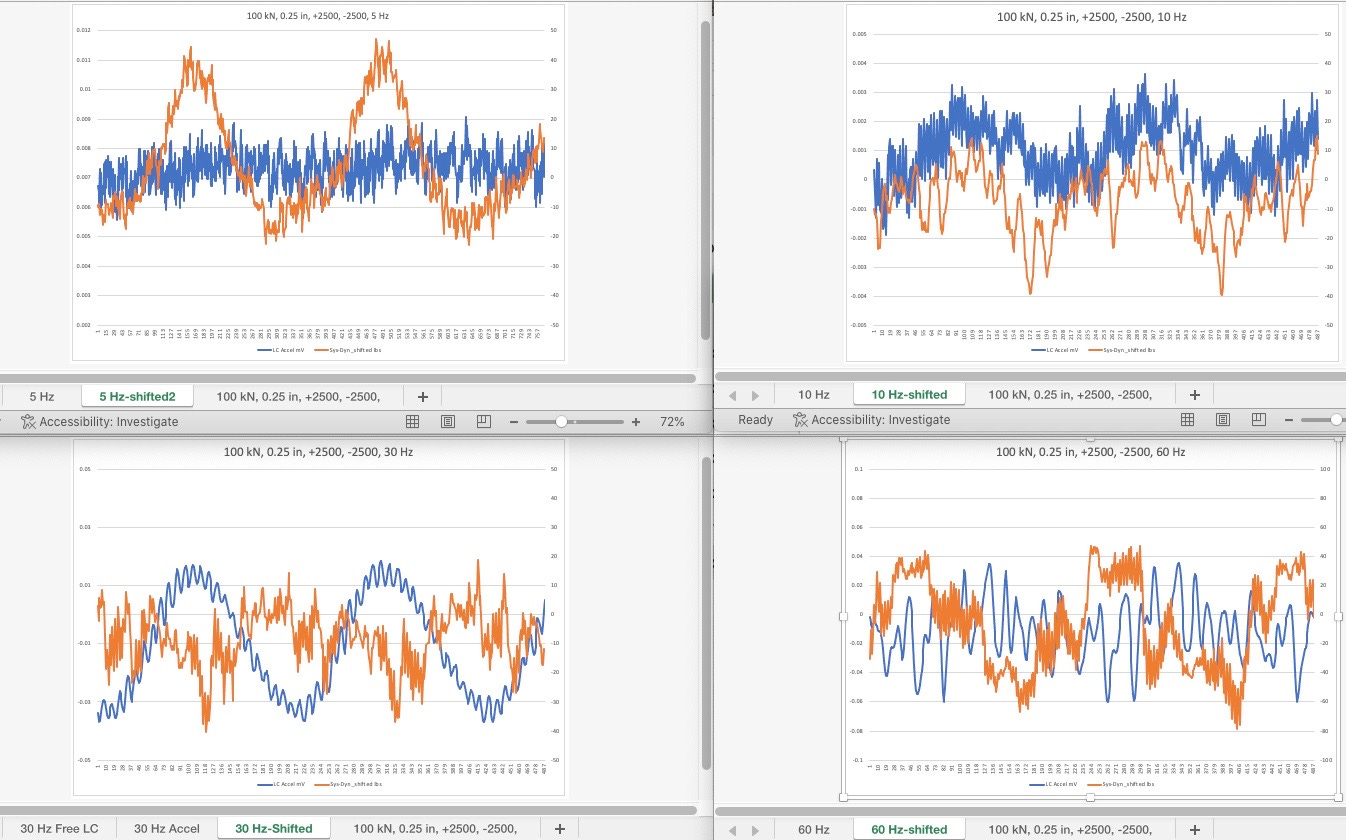
Plot Set C
Stiffer dynamometer
Plot Set D
5 Hz testing
Plot Set E
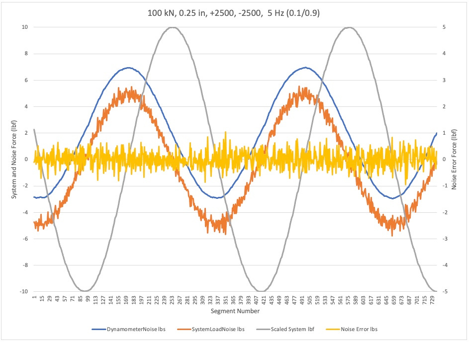
Illustration of noise on each signal individually. This was accomplished by taking the difference between two points on individual signal and playing them versus that signal. As you can see in the plot the dynamometer error signal; it is much cleaner than the system cell.
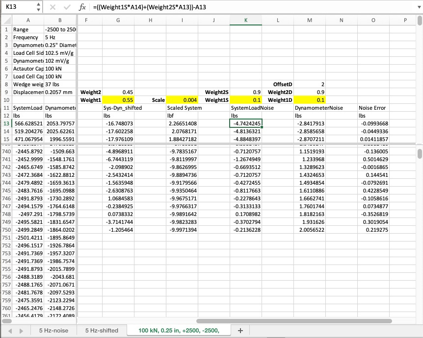
Noise for each signal. See sample calculation in spreadsheet for illustration of the method.
 | A guest post by
|
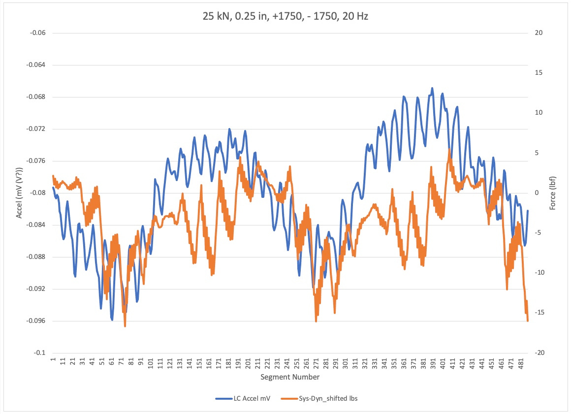
PLOT SET E
********
I tried something new today. Specifically, I calculated and plotted the noise of a signal by referencing the phase shifted signal point to the same waveform from a non-shifted signal point. In the Plot Det E section above there is a spreadsheet that shows you the calculation. I did this with the hopes that it would help show the non-smooth character of each waveform. The result I got startled me and if my initial conclusion is correct delights me.
Specifically, you will see in the figure and Plot Set E that the noise, as I call it, of the dynamometer is very low whereas the noise on the system load cell is quite pronounced. Is it possible that it is showing us that all of the acceleration induced noise is on the system load cell and not on the dynamometer? It needs more investigation. However, if correct this might provide a relatively straightforward way for a user to check general noise level on the system load signal during cycling operation.
I performed the E467 calculations on the +/- 2500 lb, 100 kN frame, 0.25 in diameter bar at 5 Hz. With the peaks and valleys identified for both the load cell and dynamometer, the largest valley error is 6.77 lbf and the maximum peak error is 7.28 lbf. I understand that when you look at the entire plot of error there are expected acquisition errors away from the peak and valley, but I don't see that a 0.135% and a 0.146% maximum valley and peak error shows bad correlation between the data. I am looking for my baseline noise on the accelerometer file, but can't find it. I also realize that I noted all of the accelerometer units wrong. They are in Volts not mV.